Map Showing How Big Africa Really Is Goes Viral
Summary
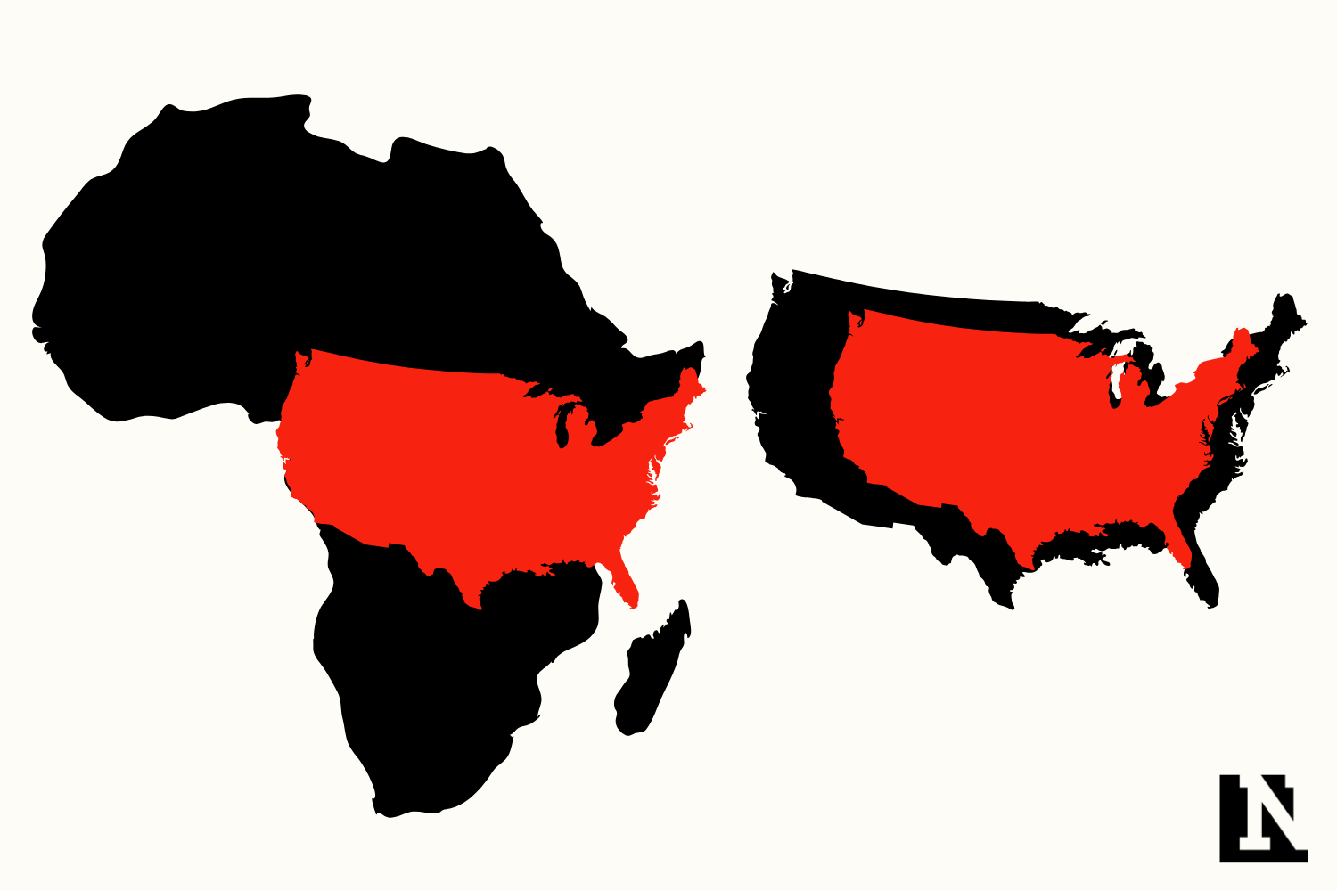
A social media post showing a map that accurately displays Africa's size compared to other parts of the world has gone viral. This sparked discussions about how common map styles can distort perceptions of continent sizes.Key Facts
- A map showing Africa's true size compared to other regions went viral on social media.
- The post, shared by Africa First on X, received over 2 million views.
- Many people were surprised by how large Africa really is compared to the United States and China.
- Africa covers about 30.2 million square kilometers, over three times the size of the U.S.
- The Mercator projection, commonly used in maps, distorts the size of regions near the equator.
- The Mercator map style was developed for navigation and makes areas like Europe and North America look bigger.
- Alternatives to the Mercator projection exist that show land sizes more accurately but are less well-known.
Read the Full Article
This is a fact-based summary from The Actual News. Click below to read the complete story directly from the original source.