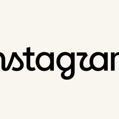
The new Instagram logo is the perfect embodiment of AI slop
Summary
Instagram has updated its wordmark logo for the first time in 10 years. The new design features changes in letter shapes and spacing that some observers say look similar to mistakes often made by AI-generated images.Key Facts
- Instagram revealed a refreshed wordmark logo recently.
- This is the first update to the logo's text in 10 years.
- Instagram's head, Adam Mosseri, described it as leaner and more modern with references to the original design.
- Some people noticed the new logo looks like it says "Instagzam" due to the letter shapes.
- The spacing between letters (called kerning) seems uneven, especially around the letter "g."
- The letter "r" in the logo looks more like a "z," leading to confusion.
- The article compares the logo’s appearance to errors often seen in AI-generated images.
- The design may unintentionally reflect the current era of AI-produced content.
Read the Full Article
This is a fact-based summary from The Actual News. Click below to read the complete story directly from the original source.